Friday, December 5, 2014

Day 74 - Problem Solving Using the Five Whys

Problem solving requires getting to the root causes of the problem. To figure out the root causes you need to dig deep into the underlying sources and symptoms of a problem. But how do you clearly discover and articulate the actual problem?  Use the "Five Whys" iterative question asking technique. Each subsequent question forms the basis for the follow up question.

When asking the five whys make sure you write down the specific problem/s and answers to your questions. The real problem is likely to change or come more into focus the deeper you dig.

Classic example of the 'Five Whys'.
The problem: the car won't start.
  1. Why? The battery is dead (first why)
  2. Why? The alternator is not functioning (second why)
  3. Why? The alternator belt has broken (third why)
  4. Why? The alternator belt was well beyond its useful service life and wasn't replaced (fourth why)
  5. Why? The vehicle was not maintained according to the recommended service schedule (fifth why, a root cause)
Sunday, November 30, 2014

Day 73 - Five Tips for Multi Screen Context

When you design a software product always think of the larger context of the multi-screen world.  Designing for context means aligning your customer requirements at any given time at any given place.
  1. Understand how context affects usage for a smartphone, tablet, desktop, watch, smart TV, car etc.
  2. Think about how your user shifts between multiple devices and form factors while using your software or app.
  3. Think about how the context of each device experience compliments the other.
  4. Synchronization and continuity of the experience between multiple devices is important to your user. Without the continuity the experience becomes jarring.
  5. Accommodate for the user on the go as well as the user in a specific location.

Sunday, November 2, 2014

Day 72 - How Do You Design for a Global Audience?

In an interconnected world, the internet allows you to reach a global audience.

So how do you design for a world in which there are cultural differences?

UX godfather Don Norman says to Design for the task. So try task-centered-design instead of human-centered-design. If you design for the task it will fit nearly all cultures.

There are many examples of this. Think of a violin or a refrigerator...they're the same all over the world in the places that have these objects.

Thursday, October 30, 2014

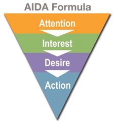
Day 71 - Tip Toolbox - AIDA Formula for Content Marketing

If you create copy and content you should know this classic formula that's been used by advertisers and marketers for decades.  This framework is used for all media whether it's advertising, emails, websites, radio, etc.

see AIDA
  1. Attention: Get their attention.
  2. Interest: Keep them interested with interesting facts.
  3. Desire: Make them really want to buy it.
  4. Action: Get them to take the action you want.

Add the AIDA formula to your toolbox!

Friday, October 24, 2014

Day 70 - 7 Persona Characteristics

A persona is a way to model, summarize, and communicate research about customers.  The fictional character in a persona is depicted as a specific person but synthesized from observing many customers. Building a persona?  It should have these 7 characteristics:
  • Social and demographic attributes
  • Needs, desires, motivations, goals
  • Consumer habits and behaviors
  • Expertise
  • Cultural background
  • Must do, must never
  • Customer experience goals

Tuesday, October 21, 2014

Day 69 - 5 Mobile Design Tips We Sometimes Forget

  1. Lead the user toward the next step.
  2. Match your interactions to your platform.
  3. Use clear and simple icons.
  4. Less is more.
  5. Not everyone speaks English; remember your international users and see number 3 above!

Day 68 - Interaction Design Tip - One Time Actions

You may need to have users perform an action one time and communicate that the action will not be performed again.  For example if the user is doing an install.
  • In this case the solution would be a button labeled "install".
  • The button can have a subtle animation when pressed.
  • Transform the button into a label specifying the result of the action, e.g. "Installing".
These steps can be generalized into other one time actions by using buttons and labels to communicate the status of the actions.

Monday, October 20, 2014

Day 67 - Interaction Design Motion - Disney Animation Principles

With mobile app platforms and emerging technologies becoming more immersive and dynamic, it's important to understand animation as a ux or interaction designer.

These are Disney's 12 Rules of Animation:
  1. Squash and stretch
  2. Anticipation
  3. Staging
  4. Straight ahead / pose-to-pose
  5. Follow through / overlapping-action
  6. Slow in and out
  7. Arcs
  8. Secondary action
  9. Timing
  10. Exaggeration
  11. Solid drawing
  12. Appeal

Sunday, October 12, 2014

Day 66 - 'Sign In' vs. 'Log In'

This isn't written in stone but as a rule of thumb use "Sign up" & "Log in".  The second word is lower case unless your capitalizing all the words on all your buttons.  "Log in" is the verb form while "login" is a noun.  If it's an action use the verb form.  Also use "Log out".

Monday, October 6, 2014

Day 65 - Empathy and Collaboration in Design Thinking

Design Thinking is a process designers can use to create solutions that match people's needs. The process looks something like this:
  1. Empathize
  2. Define
  3. Ideate
  4. Prototype
  5. Test
Two things that must permeate the design thinking process are empathy and collaboration with the target audience.

Empathy is a feeling of affinity with others that is a soft skill. As a ux designer or product manager, you must continually possess and develop it in order to create useful solutions for your customers.

Collaborate with your target audience by directly talking to them to understand the context and culture of your users. As you gain an understanding by using direct observation and qualitative data, you can articulate the problem out of which you create user stories and solutions.

Wednesday, October 1, 2014

Day 64 - 10 Call to Action Tips

A "call to action" (CTA) is an instruction to the user that prompts an immediate response such as "Sign Up Now" or "Create an Account".
  1. The human mind expects the call to action. It's part of the logical progression of a landing page.
  2. Design your page in a logical flow that creates anticipation for your call to action.
  3. Make your call to action obvious.
  4. Avoid overkill to action.
  5. The call to action should be simple. Make it concise and compelling.
  6. Clearly offer value to the user for taking action.
  7. Tantalize with curiosity (but again, see number 6 above and always offer value).
  8. Have your call to action reinforce a psychological sense for reward.
  9. Use color to emphasize your call to action.
  10. Have one main call to action per task.

Tuesday, September 30, 2014

Day 63 - UI Layout - Try Single Columns Instead of Multi-Columns

Multiple columns break the eye flow and work flow. However a single column design will give you more control over the narrative. There's also plenty of room in the single column design for inline help and error messaging.

Having a single column leads to more scrolling. But don't feel perturbed into having scrolling if it's necessary.  Good tab ordering can help with this. User testing should give more objective results.

Try a single column layout and lead people through a story.  At the end of your story present your users with a call to action.

Friday, September 26, 2014

Day 62 - The Who, What, and How of Your Users

Personas are WHO your customers are.
User Stories are WHAT they want.
User Flows are HOW they get it.

These three together help you identify the who, what, and how of your customers. They can help you and your team empathize with your users and build a better product.


Day 61 - 10 Content Strategy Tips of the Day

  1. Put yourself in the user's shoes and always keep them top of mind.
  2. Speak in the customer's voice and language.
  3. Don't use jargon your customers won't understand.
  4. Segment your audiences for targeted messaging.
  5. Focus on helping people.
  6. Look for examples of effective microcopy. Microcopy is instructional text such as field labels, button names, error messaging, and confirmations.
  7. Plan a content audit.
  8. Use metadata for SEO, taxonomy, and accessibility.
  9. Have calls to action.
  10. Be goal oriented in your copy.

Day 60 - 4 Tips When Hiring UX Designers (or anybody really)

What should you look for when hiring a UX designer?  A great portfolio? Of course. Did he or she come via a referral or someone you know and trust? Yes, that makes sense too. But in addition to these traditional approaches for hiring, try and see if your candidates fit this framework by probing deep with questions.
  1. Are they reliable.
  2. Do they get things done.
  3. Are they smart.
  4. Do you want to spend a lot of time with them.
If they don't meet this criteria you probably want to think about hiring somebody else.


Monday, September 15, 2014

Day 59 - Time Estimate Formula

Try the PERT formula to help you guesstimate how long those project tasks are going to take. It's a three-point estimate which you can use for estimating costs or time durations.


So you'll take your best guess at filling out the formula

Fill out the "a" - Optimistic time in # of hours
Fill our the "b" - Pessimistic time in # of hours
Fill out the "m" -Most Likely time in # of hours

The 'm' (Most Likely time) is then multiplied by 4.
4m is the weighted average.

Next add those three numbers together:  a + 4m + b
Once you have that result divide that number by 6.

'E' is the result.

You now have your best guess at a time estimate as to how long something is going to take!

------------------

Example.  Lets say you want to calculate how long it's going to take you to complete a wireframe for a simple search bar you're designing.  How long will it take?

E = (a + 4m + b) / 6

8 hours is your optimistic guess
20 hours is your pessimistic guess
12 hours is most likely guess based on your experience

E = ( 8 + 4*12 + 20 ) / 6
So the result is 12.6 hours

12.6 = ( 8 + 48 + 20 ) / 6

Day 58 - "To Make a Long Story Short ..."

UX in a nutshell.

Saturday, September 13, 2014

Day 57 - Quick Tip - User Goals

When creating a user experience, you always need to strike a balance between the business objectives and the customer's goals.

Apply this easy trick to remember what the user goal is:

The User is a ________ (blank)
Who Wants to _______ (blank)

E.g.  If you were talking about a fast food business you might say "The User is an Office Worker who wants a fast, cheap meal".

'The user is a _( blank )_ who wants to _( blank )_ is a powerful tool to help you prioritize what's important in your project.

Thursday, September 4, 2014

Day 55 - User Interviews - Questions to Ask

UX is about building something based on research not intuition.

You want to build something people want. But in research interviews, you generally don't want to ask what people want.  It could lead to wrong insights. You want to discover problems and find their root causes.

Better questions to ask in user interviews:
  1. What are you trying to accomplish?  Try and find some context for what they want to get done. 
  2. How do you currently do this?  Try and understand the series of steps they go through.
  3. What could be better about how you do this?  Search for opportunities.

Wednesday, September 3, 2014

Day 54 - Tip - Productivity and Goals

When building a business or product, don't start with tactics.  Want to be productive? Start with the end goal in mind and work your way backwards into tiny digestible steps on how you're going to get to the goal post.
  1. Goals
  2. Strategy
  3. Tactics
  4. Tools

Saturday, August 30, 2014

Day 53 - Maslow's Heirarchy - Designing for Motivation

Maslow's heirarchy of needs is a theory in psychology about human motivations.


The motivations are often portrayed with the most fundamental needs at the bottom of a pyramid and the self-actualization needs at the top.

Psychological needs -  basic human needs like breathing, food, water, sex, excretion..

Safety needs - personal security, safety, health, order, shelter..

Love and belonging - social interactions, relationships, friends, family, community..

Esteem - recognition, status, prestige..

Self-actualization - peace, knowledge, self-fulfillment, personal growth..

As an exercise, think of any product or service and where you would place it on the pyramid diagram.
Here's a small list to get you started.
Health and fitness apps, blood pressure apps, games, the iPhone, Google Docs, wikipedia, a Prius, a Tesla, Chase Bank, Geico auto insurance, AirBnb, Match.com, Bayer aspirin, cotton candy...


Wednesday, August 27, 2014

Day 52 - 10 Tips to Critique Design Work and Be Critiqued

Having your design work critiqued can feel stinging. Likewise critiquing someone else's work or providing meaningful feedback can be painful as well as you might be afraid to be honest.
Here are tips for providing relevant feedback.
  1. Use formal critiques
  2. Set the critique guidelines e.g. goal is to make product better not to personally criticize
  3. Set the stage for the critique by reiterating business goals, customer goals, schedule
  4. Be candid and specific
  5. Tie everything to goals
  6. Confirm what works
  7. Discuss problems first then propose possible solutions
  8. Walk in the customer's shoes and simulate the customer experience
  9. Gather feedback and discuss
  10. Write down feedback

Tuesday, August 26, 2014

Day 51 - Dark Patterns - "Sneak into Basket"

Not all design is good design.  Some websites and apps are downright deceitful the way the try to trick their users. Learn to recognize dark patterns but don't use them.

One dark pattern is called the "Sneak into basket" technique.
The sneak into basket approach is used in eCommerce when a user attempts to buy a specific item. Somewhere in the customer's purchasing workflow the site sneaks an additional item into their basket often through the use of an opt out button or check mark on the previous page or below the fold.

Some dark patterns such as "sneak into basket" are now even illegal in the UK.

When up-selling or cross-selling additional products, services, or features to your users, be open about it.

Monday, August 25, 2014

Day 50 - Usability Testing - Vendors vs. DIY

When recruiting interviewees for usability and research tests you can either partner with a vendor or do it yourself depending on the budget and scope of your project.

USING A VENDOR:
  • Can save you time
  • Be expensive
  • Give you less control
  • Leverage usability testing skills they may be better at
  • Access to user and client relationships you don't have
  • Provide blind testing
THE DO IT YOURSELF (DIY) APPROACH:
  • More of your time
  • Cheap
  • More control
  • You own the relationships
  • Can be blind
  • Learn about your users by doing your own recruiting

Day 49 - Web Design Tip - Above the Fold

"Above the fold" is originally a newspaper term describing the upper half of the front page where the most important stories and headlines of the day are located.

According to a Jakob Nielsen study on scrolling (in his book "Prioritizing Web Usability"), only 23% of the visitors in his study scrolled. Most people don't scroll down a page.

When designing your website, you generally should keep your primary call to action and succinct value proposition above the fold so users don't have to scroll down or work to find out what your site is basically about.

You only have a few seconds to pique and maintain someone's interest when they come to your site before they hit the back button and abandon the web page. Reduce this friction by showing them the value quickly the moment they hit the page and encourage them to take action.

Day 48 - Usability Testing - Getting Participants for Your Research

How would you go about finding people to interview for your research and usability testing of your prototype?
  1. Have a tight deadline.  Lock the calendar date of when your user interviews will take place.
  2. Create a screener questionnaire by defining your criteria, writing the questions and creating a Google Form. Also see Google Venture's worksheet for writing a screener.
  3. Create a Craigslist Ad with a link to your form.
  4. Offer payment or reward for participants.
  5. Choose your interviewees carefully. Your ad and questionnaire should be used to vigorously filter out and disqualify candidates that don't meet your target user criteria.
  6. Get NDA signed - Get their permission/signature to record the interviews. Also, "The ideas that come out of this, I own that".

Sunday, August 17, 2014

Day 47 - User Behavior - Fogg's Behavior Model

BJ Fogg's Behavior Model illustrates how three ingredients must simultaneously come together in order for a user's behavior to occur.
  1. Motivation - Pleasure/pain, hope/fear, social acceptance/rejection.
  2. Ability - How proficient is the user in doing something. Is it easy to do, hard to do? These elements affect ability:  time, money, physical effort, brain cycles, social deviance, non-routine.
  3. Trigger - Triggers are a call to action that tell people to do it now.

Thursday, August 14, 2014

Day 46 - Customer Journey Key Principles

  1. Put your customers in control.
  2. Let them explore before they commit.
  3. Let users purchase as a guest. One time customers are especially appreciative of this.
  4. Make it easy to finish on another device.
  5. Take advantage of existing user information you already have to make conversion as easy as possible.
Read more about Customer Journey Tips.

Sunday, August 10, 2014

Day 45 - 3 Content Strategy Rules of Thumb

  1. Identify your objectives.
  2. Think and write like your audience.
  3. Be SEO friendly.

Saturday, August 9, 2014

Day 44 - User Interface - 10 Modal Window Best Practices

A modal window is a pop up window that displays content while temporarily blocking the main page behind it.  The modal window requires users to interact with it before it can be dismissed. Modal windows prompt users to take action and provide fast, focused, contextual interaction.

Logging in to a website is one example where you could have a modal interaction. From any page you could sign in, complete the form, then get back to your task.
  1. Make sure that modal windows are accessible to users with disabilities.
  2. Can be used to draw attention to vital pieces of information and calls to action.
  3. Can be used to block the application flow until the user enters the required information to continue.
  4. The can serve as a notice or warning that the effects of the current action are not reversible, e.g. "..the files will be permanently deleted".
  5. Include a clear visible title on the modal window that matches the button text on the main application window they clicked.
  6. Offer a high contrast close button in the top corner.
  7. On desktop computers allow users to cancel the modal window with the esc (escape) key.
  8. Avoid scrolling in modal windows.
  9. Don't make the modal too wide or tall so that it's partially obstructed to the viewer.
  10. Modal windows can be effective but can also frustrate users when done wrong or over used.

Friday, August 8, 2014

Day 43 - When We Sell UX

As User Experience practitioners we need to be able to sell UX. When we sell UX we need to:
  1. Figure out what is most valuable to our users.
  2. Show the value of UX by speaking the language of our users. Don't use technical industry jargon that people might not understand.
  3. Show empathy for the team you are selling to. They are your customers too, not just the users.
  4. Teach your customer (the client hiring/paying you for UX) to want to desire what you know will help them.
  5. Figure out what is valuable to them (the client).
  6. Explain the value of your UX work to them in terms of "less rework, time saved, more revenue, customer satisfaction".
  7. Don't just speak in terms of deliverables. Speak in terms of meaning and strategy - challenges, problems to solve for, aspirations, activities.
What methods do you use to sell UX?

Thursday, August 7, 2014

Day 42 - Write a UX Thesis Statement for Your Product Design

A thesis or problem statement is a formal declaration put forward as a premise to be proved.  It represents the values and promise your product will solve in a short sentence or two.
  1. Write down the problem or current state not worrying too much about the quality at this point.
  2. Focus on the desired and future state.
  3. Define how your customer's life is better because your product exists.
  4. Consider what your design does for your customers AND your stakeholders.
  5. Edit, Edit, Edit. Rewrite, Rewrite, Rewrite.
  6. A thesis statement must be a declarative statement.
Take a look at the Product Hunt page.  These aren't thesis statements per se but great examples of articulating value propositions in just a few words for each product. The tag lines for these products are short and to the point.

Monday, August 4, 2014

Day 41 - Get Comfortable with Your Wireframing Process

Wireframes are the diagram flows which show the functional elements of a website, app, or component. There isn't only one way to wireframe. People use different processes.  Find the process that's most efficient for you and and the team that you need to deliver to.

Here are some approaches:
  • Sketch  --> Wireframe  -->  Visual Design  --> Code
  • Sketch  --> Wireframe  -->  High Fidelity Wireframe  --> Visual Design  --> Code
  • Wireframe  -->  High Fidelity Wireframe  --> Visual Design  --> Code
  • Sketch  -->  Code
  • Wireframe  -->  interactive Prototype  --> Visual Design  --> Code
What's your wireframe process?  What has worked best in your experience? Let us know in the comments.

Day 40 - Interacton Design Techniques - Progressive Disclosure

Progressive disclosure is an interaction design technique that initially only shows users the most important actions required.

A print dialog box is a classic example of progressive disclosure. When you hit 'print' you're presented with a dialog box with a small set of choices. There's typically more print features and functionality that are initially hidden as to avoid end user confusion.

Using progressive disclosure techniques the user sees tasks unfolding via a dynamically expanding UI (e.g. a form grows with more choices).  This can help users form a correct understanding of the task.

Start by showing the UI controls for the first step of the task, and when the user's done with that step present them with the second step, and so on.   Users should have the ability to easily go back and change answers and change their mind about earlier choices.

Hiding advanced functionality early from novice users can lead to increased success of it's use later on.

While progressive disclosure techniques are applied in many products empirical research is required if you're going to employ these techniques.

Example of progressive disclosure:


Sunday, August 3, 2014

Day 39 - List of Prototyping Tools

A prototype is a preliminary model of a new product used to test and evaluate a design. It's purpose is to allow users of the software product/service to assess proposals for the design so you can get feedback, learn, and iterate.

Again, remember that the goal of building a prototype is not the artifact itself but feedback so you can learn.

Here's a list of prototyping tools:
  1. Axure
  2. Balsamiq
  3. Concept.Ly
  4. FieldTest
  5. Flinto
  6. Fluid UI
  7. Framer
  8. Interface
  9. Invision
  10. Justinmind
  11. Keynotopia
  12. Marvel
  13. Pencil Project
  14. POP
  15. Proto.io
  16. Solidify App
  17. UXPin
What prototyping tools and techniques do you use?  Add them in the comments.

Friday, August 1, 2014

Day 38 - 10 Mobile Interaction Design Tips

Taking complexity and making it easy is hard. Focus, iteration, testing, and polish is required for good app design. Keep these mobile tips in mind when designing an app.
  1. Stay focused on the goal.
  2. Start with sketching, not a computer. It's not about drawing it's about design.
  3. Match the interactions and affordances to your platform. Pay attention to developer design guides, conventions, and patterns.
  4. Less is more so keep it simple. Limit and consolidate the number of elements for a clean design.
  5. Provide the user with cues and meaningful feedback about their interaction whether the user makes mistakes or not.
  6. Create hints for users so you can lead them through a design.
  7. Build a visual and approachable hierarchy.
  8. Sliders should convey movement or progress.
  9. Remember to consider international users. Great icons don't require text. Just be careful of cultural bias.
  10. Empower your user with mobile interfaces that accommodate to their skills.  Your app should adapt with a learning process progression so that users can do things faster once they understand the basics. Let go of the hand holding and give them shortcuts so that the app alters itself to a user's comfortable experience.
Take notice of some of the best mobile interactions you've experienced as wells as the poor ones.  Think about the apps you interact with daily on your device and how you engage with them.  As a writing exercise list them out.

Wednesday, July 30, 2014

Day 37 - Real People Are What Matters

The user experience practice is filled with advantageous methods to gain insights into how customers operate.  When working in UX,  it's easy to put emphasis on the processes and tactics of user experience and drift away from the true needs of the customer.  Apply good UX techniques, but be mindful so as not to get stuck in pure academia.  People are what matter in user experience.

Rule of thumb: Don't get stuck in academia, focus on real people.

Tuesday, July 29, 2014

Day 36 - User Centricity

  1. In a UCD approach, your customers are the focus not the features.
  2. Design for users and their tasks.
  3. Use natural and easy to understand language.
  4. Show consistency and make your product approachable.
  5. Reduce anxiety and mental effort on the part of the user engaging your product.
  6. Every workflow has a trigger. Define what initiates a workflow based on the user's needs.
  7. Understand the context of when, where, and how the user will use your service.
  8. Additionally understand the context end points of what your users are doing before and after they're experiencing your product.
What are some of the best user centric solutions you've seen designed? List them in the comments.

Thursday, July 24, 2014

Day 35 - Device Breakpoints and Screen Size Detection

With so many new different computing devices on the market,  there are no common screen sizes. Breakpoints are the point at which your site's content or layout breaks on a device and needs to be adjusted for clarity and usability.

By adding breakpoints and screen detection rules about width and styling in the code (media queries in the CSS) your site's layout and typography can adapt legibly to multiple devices and screen sizes.

Test your web apps and sites on as many different devices as you can get your hands on. When the layout isn't working at a particular width and needs to be adjusted, define your own breakpoints in the CSS and adapt the layout.

Breakpoint rules of thumb:
  • Typically change styling of your documents so that it's best suited for the user using their device.
  • Always be concerned with readability and font sizes.
  • When designing for "mobile first" think "content first". It's the content and your design flow that defines the breakpoint, not the pixel width of the most popular device.
  • Make your designs adaptive so that they're future friendly as widths are growing and changing.
  • Horizontal scrolling is a bad idea.
  • It's not probable that you can cover all device types, but try and design usable solutions for your customer segments.

Wednesday, July 23, 2014

Day 34 - Product Market Fit

What is Product Market Fit?  It means being in a good market and the product can satisfy that market.

When you achieve Product Market fit the experience is so good it's a leap forward and drives a user to adopt a new behavior e.g When Uber first came on the scene people hadn't experienced pushing a button on their phone that would immediately summon a classy, reliable ride at their behest.

BUT, the market size matters most for Product Market Fit. You can build a better mouse trap (software solution or experience) but if there's no mice (customers) it doesn't matter.  For a product to be successful, it's not enough for the product to be great, the customers have to WANT it.
  1. Articulate a value proposition and try and validate by testing with real users. Talk to real people.
  2. Build something people want that solves for THEIR real problems, not yours. Ask them what their pain points are.
  3. Product Market Fit is essential before substantial growth of your user base.
  4. Usage - If at least 40% of your users would be unhappy if your product were no longer available you've reached Product Market Fit.
  5. Marc Andreessen of Andreessen Horowitz says that "The only thing that matters is getting to product market fit."

Thursday, July 17, 2014

Day 33 - Ten Onboarding Tips for First Time User Experience

New users opening up an app for the first time need help understanding what is going on. The interactive wizard-like flows of Onboarding users introduce and engage your audience as to what your product's all about.

Onboarding is the process of increasing the chances that new customers become successful in embracing your product the first time they try it out for themselves.

Your product design should be so great that it requires no onboarding process. Few prodcuts are that good.  Onboarding is there to ensure a customer successfully engages with your product or service.
  1. Guide the customer through the first time experience but let them do it. Customers learn by doing as you show them not by you telling them.
  2. Visual cues, highlights, subtle animations, and popover bubbles can be helpful in focusing their attention through the onboarding flow.
  3. Simple explainer videos can help. Although if you need lots of videos and manuals to explain how to use your product, your product's usability might not be very good.
  4. Focus on the core, relevant experience. Don't cram all the features into onboarding.
  5. Keep it short and get right to the "Wow" action so that the user can engage.
  6. Onboarding should be dead simple to understand, delightful, and work perfectly.
  7. Remove distractions and lock down features that may veer them off the onboarding process.
  8. Be adaptive. Confine users to an onboarding path of success, but let them skip the onboarding process if they wish to.
  9. Customers should have the ability to abandon the onboarding process at any time and be able to come back and change their responses.
  10. Always be tweaking and improving your onboarding process.
  11. Identify the must-have experience that keeps people coming back and incorporate that into your onboarding.
  12. Interview people who finish the onboarding tour and become highly engaged users. Interview people who abandon the onboarding process.
Action: Study the onboarding process of successful games like Candy Crush. There's a lot you can learn from the first time experience tutorials of popular games that you can incorporate into your user onboarding procedures. Tell us about great onboarding processes you've experienced in the comments.

Tuesday, July 15, 2014

Day 32 - 7 UI/UX Principles of Great Design

  1. Good design let's the interface disappear behind the experience.
  2. Users are "Wow'd!", surprised, and delighted.
  3. Recurrence. People love your product so much they use it daily.
  4. People put your app icon on their home screen or desktop screen for quick access.
  5. Users would be terribly sad if your product was gone.
  6. People tell other people about your app.
  7. And oh yeah... scrolling is often faster than paging.

Sunday, July 13, 2014

Day 31 - 6 Lean UX Tips

Lean UX is a set of flexible activities that teams use to attempt to rapidly create user experiences. Lean UX is based in agile and lean startup methodologies where the team (stakeholders, product, design, development, etc) swiftly creates prototypes, tests, and iterates while balancing business needs and customer needs. The key is to externalize and share broadly.

A teams's lean ux process may look like this:
Strategy session -> Business needs -> Audience needs -> Ideation -> Sketching -> Prototyping -> Testing

Or put another way:
  • Think
  • Make
  • Check
  1. Understand the business/customer needs and have the problem you're solving for articulated. Get stakeholders aligned and get business goals prioritized.
  2. Have stakeholders work on the big picture concept. The designers should work on the details.
  3. Make customer personas rapidly getting people to show them to each other and present them.
  4. Scenarios - what are these customers thinking about in the moment they are engaging. What motivates the persona? People can work as teams on this.
  5. Ideation and Sketching. Get people to individually, rapidly create/sketch volume in this step and quickly iterate on the designs. Present them and show them to everyone, critique and iterate.
  6. Prototype and Test continuously. Prototyping is a strategy for efficiently dealing with things that are hard to predict.
What Lean UX tips do you have? Share your Lean UX tips in the comments section.

Day 30 - Mobile Basics: Voice Recognition

Speech recognition uses your voice commands to interact with applications. It converts spoken words to text, allows you to perform searches, send messages, set reminders, interact with maps, dictate orders, etc.

Although voice recognition technologies have been around for many years the technologies have a long way to go before they truly recognize natural conversation.

Things to consider when designing for speech interactions and touchless operations:
  1. The voice persona.
  2. Provide immediate feedback for every speech input.
  3. Is active voice vs. passive voice preferable.
  4. Is voice support absolutely necessary.
  5. Will voice be used for both input and output.
  6. Environmental barriers e.g. people around you listening in to your voice commands, privacy concerns.
  7. Error rates in speech recognition can lead to abandonment of the product.
  8. Avoid modes, but allow users to quickly turn speech recognition on/off or easily switch to other ways of interaction.
  9. Use speech when the user's eyes and hands are busy.
  10. Developing the right voice interactions can make the user experience more human.
Technologies such as Apple's Siri"Ok Google", and Microsoft Cortana open up a world of interaction possibilities.  What are some ways you use voice interactions?

Thursday, July 10, 2014

Day 29 - Mobile Basics: Accelerometer

Built into the circuitry of your mobile phone or tablet, the accelerometer is a miniature device that knows up from down and is commonly used to change your screen from portrait mode to landscape view when you turn it.

By reading data from the physical world into your app, the accelerometer reads in that sensor data and does something relative to gravity or acceleration.

Besides portrait and landscape orientation, the accelerometer can be applied to other uses such as:
  1. Controlling sound when you tilt the phone.
  2. Creating a jump rope sensor fitness app via the accelerometer sensor.
  3. Calculate the steps you take whether walking, running, or jogging.
  4. Detecting when to snap a photo via shaky hands by sensing when you're holding steady.
  5. Shaking your phone to lock it.
There's endless ways to incorporate the accelerometer into the user experience.

What are some creative ways you can use to apply the accelerometer to your designs?

Wednesday, July 9, 2014

Day 28 - Mobile Basics: Gyroscope

The gyroscope is a hardware sensor in your phone and tablet that gives you the changes in any rotation orientation of the device.  It rotates around gravity.

Used with other hardware features like the accelerometer, magnetometers, and compass, the gyroscope can be used for augmented reality apps, gaming, and navigation systems to name a few examples.

An example of an app that uses a gyroscope is a constellation app whereby the user simply points their device to any part of the sky to identify constellations, stars, and planets.

When designing for mobile, don't just think in terms of a flat space on a 2d screen. Think about 3d space, the environment a user is in, the context of the problem you're solving, and how the mobile device hardware can be used in your designs.

What sort of applications would you design that take advantage of a phone's gyroscope?

Tuesday, July 8, 2014

Day 27 - 10 Color Tips for UX Visual Design

"Why do two colors, put one next to the other, sing? Can one really explain this? no. Just as one can never learn how to paint." ~ Pablo Picasso

Casual observations and anecdotal evidence about color suggest that in can persuade decision making. Color matters although ultimately the psychology of color and color preferences are dependent on personal experiences.

When dealing with color:
  1. Use existing colors that are on brand and follow the brand's style guide or visual specification.
  2. If no previous color specification exists, free color generators such as Adobe Kuler or Colour Lovers can help you explore color themes and palettes.
  3. Color is part of your brand's personality. Keep it simple and use it wisely.
  4. Choose a harmonious font color palette for your headings (titles), subtitles, body text, and links.
  5. Ensure that your font colors are accessible to people with disabilities and have proper contrast.
  6. If you're on brand but you're at a deadlock as to which of two colors to use for your call to action button, run an A/B test on the colors.
  7. Combine color with design fundamentals like shape, space, and typography. Don't rely on color alone. 
  8. Test pages and designs by going to grayscale to make sure usability doesn't break when color goes away.
  9. Use tints and shades instead of additional colors.
  10. Although subjective, think about emotional reaction:
  • Red: Exciting, passionate, dangerous
  • Pink: Sweet, young, energetic
  • Orange: Friendly, tangy, pleasing
  • Yellow: Energetic, warm, cheerful, cautious
  • Gold: Stable, elegant
  • Green: Alive, friendly, organic, money
  • Dark Blue: Peaceful, stable, logical, trustworthy, water
  • Light Blue: Healthy, cool, young
  • Purple: Elegant, mysterious, regal
Now it's your turn: Look up the meaning of complimentary colors, as wells as analogous colors and see how they relate to each other on the color wheel.

Monday, July 7, 2014

Day 26 - Changing Careers from Graphic Design to UX Design

The old graphic design world is based in static or print design. Today's design requires motion, depth, and interaction.  If you want to make the transition into a user experience design career, it's going to take work.
  1. Pick an area to focus on whether it's interaction design, visual design, content strategy, etc.
  2. Learn UX.  Even if someone can't afford to go to school for UX there's endless information on the web to help you hone your user experience skills from YouTube videos, to sites about UX, to free online courses.  Pick an area you'd like to focus on and allocate a specific time each day to learning and studying materials related to your field.
  3. Network and find mentors.  We live in a connected world now. Be proactive and reach out to people.
  4. Practice UX.  Create a project for yourself. Create a portfolio that tells stories and solves problems.
Design challenge: Pick a project or create your own user experience curriculum.  Tell us about it in the comments.

Saturday, July 5, 2014

Day 25 - Tracking UX Metrics

What is a performance metric?  Metrics measure a project or product's performance. They are the data, numbers, and goals used to track the health and success of a project.

Measuring user experience success:
  1. Track the metrics related to your top goals.
  2. Determine what's most important to track and keep the number of metrics very small, probably one metric. For example, are you focused on retention or growth? How much will improvement in user experience help? 
  3. Engagement. Track things like how often customers use the service, upload photos, tag content, search with your product, interact with the features, sharing, etc.
  4. Track happiness. Create user surveys to examine what people think.
  5. Consistently measure and check user comments, feedback, ratings, and reviews to see where your users' pain points are so you can address them.
  6. Task success. Are users completing tasks, abandoning workflows or getting errors.
  7. Time. How much time do people spend using your service.
  8. Compare conversion rates or sales before and after the updates to the user experience using metrics such as average revenue per user (ARPU).
  9. ROI (return on investment) is always calculated in terms of increase or decrease of some key variable such as increased sales, customer loyalty, lower attrition, increased engagement, decreased support costs, etc.

What measurements do you use to track user experience for your product or service? Share your suggestions for tracking ux metrics.

Wednesday, July 2, 2014

Day 24 - Mobile UX Tips to Improve Usability

Follow these mobile design tips to improve usability for your mobile customers.
  1. Innovate but don't reinvent the wheel.  Use mobile design patterns and models.
  2. Keep context in mind. Mobile users are on the go.
  3. Design for the immediacy of now.
  4. Don't let interruptions get in the way of user experience. Make the app easy to disengage and easy for people to pick up where they left off.
  5. Align with device conventions so as to not create confusion, e.g. don't user iPhone controls if the app is running on an Android device and vice-versa.
  6. Ensure that your designs are tap and finger friendly.
  7. Break larger tasks into smaller ones so that you don't overload the user.
  8. Use in app analytics such as Google Analytics or Flurry to measure and improve the experience.
What are some other best practices?  List them out or add them in the comments below.


Day 23 - What is Responsive Design?

People use phones, tablets, and desktop computers every day, and there are more devices on the way. With so many form factors, one strategy to display content appropriately for a device is responsive design. Responsive web design is a type of design strategy where you create once and run your content everywhere e.g. phone, tablet, desktop. The site design automatically adapts to how the site is being viewed. In other words, the website responds to the needs of users based on the devices they're using.

An advantage of responsive design is that you maintain one design system rather than building and maintaining separate apps for the various device types.

When designing for responsive:
  1. Define the problem.
  2. Start with the content. It's not safe to assume screen sizes, they're changing.
  3. Design and develop prototypes using gird frameworks such as Foundation or Twitter Bootstrap.
Responsive techniques allow your product to be flexible and adjustable to the different device types and screen sizes while being accessible and future friendly.

Here are some responive design examples.

Take a look at websites on both your phone and a laptop to see how they respond.  Are they using responsive design? Are they using two different systems like mobile web and a desktop web design?

Day 22 - Mobile Basics: Bluetooth Low Energy

Bluetooth low energy or BLE is ideal for applications such as sensors, remote controls, smart watches, health measurement apps, and fitness tracking apps to name just a few use cases. Devices such as Fitbit wristbands pair with your phone using Bluetooth LE to track your body's exercise and sleep patterns.

Bluetooth LE is a technology built in to devices that uses far less power than standard Bluetooth connections that can last for "years" without needing battery replacement or recharge.  Rather than a persistent connection, BLE uses short bursts of data and powers itself off again when finished sending the data. So it's low energy.

The Bluetooth LE on your device can be used to pinpoint your precise location.  There are BLE devices to track your wandering pets, your lost keys, and many more on the way.

How many use cases you can think of for creating new services or apps for Bluetooth LE?  Make your own list or share them in the comments area.

Tuesday, July 1, 2014

Day 21 - Mobile Device Fragmentation

There's dozens and dozens of smartphone and tablet manufacturers which means device diversity with large numbers of different screen sizes, densities, and resolutions.  We need to develop a basic understanding and be aware of this when designing for mobile.  Designing for the wide variety of sizes and densities can be challenging.

When designing for mobile:
  1. UI needs to be able to adapt to those different devices.
  2. Know the difference between responsive design, mobile web, native apps, hybrid apps.
  3. Don't think that a smartphone screen is a small desktop screen. They are different experiences.
  4. Understand the basic leading target platforms Apple's iOS, Android, and Windows Phone.
  5. Understand why you are choosing one platform over another.
  6. Understand the context of how your mobile app will be used by your target user.
  7. Plan early so as to minimize the amount of time and effort required for your platform/s.
  8. Have a basic understanding of the phone's built-in hardware capabilities that can enhance the experience.
  9. Pay attention to device density and documentation.
Take a look at ScreenSiz.es
It's a screen size chart of common mobile devices sortable by device name, operating system, screen size, resolution, pixels per inch, density, and popularity.

Wednesday, June 25, 2014

Day 20 - Don't Be Evil in Your Designs

Persuasive techniques in UI, marketing, design patterns, & experience that are created to benefit companies more than their customers are evil.  Don't create user experiences at the expense of your customers. Don't spam, link bait, or trick your customers.

Here are just a few examples of what NOT to do. So be a good design citizen!
  1. Implementing dark patterns is bad. A dark pattern is a type of UI that appears to be carefully crafted to trick users. Don't be deceptive in your designs.
  2. Do not bury or intentionally hide your contact info (including your phone number) on your product or site so as to avoid speaking directly with customers.
  3. Don't use fear tactics in your value proposition to get people to buy your product. "You need this because if you don't 'X' will happen..".
  4. Don't hide disclaimers away from the "happy path" flow of product purchase i.e. tell your customer something is one price to get them to purchase then charge the customer with other hidden fees or hidden commitments.
  5. Do not disguise ads as links to content.
  6. Don't constantly bombard users with ads.
  7. Don't require users to opt-out of a service or feature they didn't want, after you've automatically opted them in without their consent. Be clear up front before they sign up for your service.
  8. Refusing to cancel or refund a user's money after having not delivered the service you promised them is bad.  Don't do that.
  9. Don't sell people on products or services you cannot deliver.

Sunday, June 22, 2014

Day 19 - Timeboxing, Simplification, and Constraints

Here are 3 strategies for getting things done - timeboxing, simplification, and constraints.

In time management, timeboxing allocates a fixed time period called a timebox to work on a task.  Sharpen your focus and overcome procrastination by putting it in a scheduled time box that you must complete. Time boxes can help you focus on the task at hand, so don't work on anything else (or surf the web) while completing your scheduled task.  When you make your to-do list for the day, make sure you schedule blocks of time for each item on the list.  With out the time component a list is just a list and not a plan.  Parkinson's law states that work expands so as to fill time available for it's completion. So try timeboxing it!

Simplify the tasks of the day and keep the list short. This will help you focus on the present too. Better to have a few things done well and complete them rather than work on a bunch of things and get nothing done. Simplify where you can. So many of us waste time lost in email.  Need to speak to someone about a task your working on? Turn off the email program and pick up the phone instead.  If you need to spend time in email for a written record schedule it as a task. Don't use email as an excuse not to complete your task at hand.

Constraints force you to be more creative and focus on solutions. Some may see constraints as a bad thing, but limiting choices in design enables you to concentrate on the purpose and design mission. Imposed restrictions will help you eliminate distractions, not waste time on things that don't apply, and help you think more creatively about how to push the design confines.

Thursday, June 19, 2014

Day 18 - Heuristic Methods for Reviewing Websites and Applications

In psychology, a heuristic is a mental shortcut or rule of thumb that allows you to quickly solve a problem or make a decision.  Review a website or app and rate each of these elements from on a scale of 1 to 5 (1 = poor and 5 = excellent).
  1. Homepage
  2. Task orientation and website functionality
  3. Navigation and information architecture
  4. Forms and data entry
  5. Trust and credibility
  6. Quality of writing and content
  7. Search
  8. Help, feedback and error tolerance
  9. Page layout and visual/aesthetic design
  10. Accessibility and technical design

Wednesday, June 18, 2014

Day 17 - Users Don't Like ...


  1. Nobody wants to work.  Make tasks easy with the least amount of work possible.
  2. People don't initially read web pages and screens they scan them. Less is more.  Don't clutter your screen real estate and make the content easy to scan. It only take a couple seconds for a user to hit the back button so get their attention quick.
  3. People don't want to think too much. Simplify and automate. Automate repeatable tasks, combine similar tasks, and break complexity down into simpler, digestible chunks.
  4. People love to share cool things they discover or create.  Your products and services should be social and shareable by default.
  5. People get bored easily.  Keep them engaged and interested by getting them to that "Aha" moment quickly and show them the value.

Tuesday, June 17, 2014

Day 16 - Customer Journey Map Tips

A customer journey map is a diagram that shows the steps a customer goes through to complete a task/s.
  1. It's important to understand the end points (start and finish) of a customer journey. What is the customer's clear goal.  Where does the journey start and end, i.e. "gets on the train in Chicago and gets off in New York".
  2. The point of a customer journey is to figure out the touch points a customer goes through to accomplish their task.
  3. Find invisible touch points. Often, all of the touch points aren't clear. For example "waiting on the train platform for a trip from Chicago to New York" might not be apparent as part of the journey.  But this is an opportunity to engage your customer in some way.
  4. Understand your customers' mindset before and after the customer journey for a more holistic, empathic account of their experience.
  5. Use a persona for your journey map.  Find the most relevant, valuable persona you can and discuss it with your client.

Wednesday, June 11, 2014

Day 15 - Card Sorting

Card sorting is a technique to find and organize the information architecture of a site or application. The information architecture is the "what goes where" like the heirarchical structure of a menu system.  A test participant in a card sorting study would be given a sets of 3 x 5 note cards with content on them. They would then review the cards so they can group them into logical orders and categories.

Card sorting sessions can help define a structure that reflects your user's desired workflow which will increase their productivity and satisfaction.
  1. Get the cards ready. List each content or information type on a separate card and limit to about 100 cards.
  2. Use data and comments to find patterns.
  3. Create a heirarchy that works for everyone.
  4. Combine cluster analysis, dendograms, and comments (what participants said in the sort) to create first pass of information architecture.
  5. To inform your analysis, also use:
    1. Usability studies
    2. Support data
    3. Search logs
    4. Web logs

Monday, June 9, 2014

Day 14 - Quick Tips User Interface Design

Remember these are guidelines, not rules. Try these:
  1. Try a single column layout instead of multiple columns to narrow distractions. Include a call to action at the end.
  2. Try consolidating similar or duplicate functions into one in order to reduce fragmentation and confusion.
  3. Reduce choices.  Too many choices may cause indecision on the part of the user.
  4. Be direct in your content. If you're copy is using words like "maybe", "probably", or "perhaps" then this is an opportunity for you to be more authoritative.
  5. Try fewer form fields and engage your users quickly.  Every form field you add makes the experience more labor intensive, increases friction, and makes it more likely that your user will drop off.

Monday, June 2, 2014

Day 13 - Be Prepared for Usability Testing

  1. Know what you're testing for when you design your tests
  2. Recruit participants
    1. Define recruitment criteria
    2. Recruit on Craigslist
    3. Paid recruitment https://ethn.io/pricing 
    4. Create Google Forms to screen and qualify candidates
    5. Survey Monkey
  3. Have all testing materials ready and practice before your testing dates
    1. Prototype/s
    2. Location
    3. Questions
    4. Schedule
    5. Participants
  4. Schedule the selected participants
  5. Conducting usability interviews
    1. Set proper expectations
    2. Shut up and listen.
    3. Avoid bias.  If UX designers conduct interviews on their own designs bias is very likely.
    4. Record the interviews.
    5. Follow up answers. Make participants feel comfortable, be genuinely inquisitive and probe deep to gain insight.
    6. Provide a reward upon conclusion - gift card, voucher, or cash.

Day 12 - Understand the User's Goals, Needs, and Tasks - Model the Solution


  1. Task Modeling - understanding what people want and how to design for them.
  2. Find out the steps people go through and the decisions they need to make. Then base your designs around that.
  3. UX is often stuck in academia. Talk to real users.
  4. With the task model, you're aligning design experiences that fit with how people expect things to work in practice.
  5. Think from the user's perspective first, but utilize systems thinking, holistic thinking about the overall experience.
  6. Empathy - understand and share your user's experience and emotion.
  7. Constantly check in with your users to make sure the UI is on point. But the goal is to be able to tell the story without showing the interface.
  8. All the details in every page and component of your product should contribute to the overall experience.

Sunday, June 1, 2014

Day 11 - Characteristics of Good Interaction Design

Here are a few characteristics of good interaction design:
  1. Understanding.
  2. Meaning.
  3. Value.
  4. Engagement.
  5. Responsiveness.
  6. Speed.

Wednesday, May 28, 2014

Day 10 - Android App Design Principles

Android can be beautiful.  Some Apple fanboys might say otherwise, after all iOS is beautiful too.  But here are some Android Design Principles to help you create better Android experiences.

1)  Enchant Me
  • Delight the user in surprising ways.
  • Let me make it mine. Users love to customize and personalize to help them feel at home and in control.
  • Get to know me.  Learn about the user and place previous choices within easy reach.
2)  Simplify My Life
  • Keep it brief and get to the point.
  • Pictures are faster than words.
  • Never lose my stuff.
  • If it looks the same it should act the same.
3)  Make Me Amazing
  • Sprinkle encouragement.  Break complex tasks into smaller steps.
  • Do the heavy lifting for me.
  • Do important things fast.
See all of the Android guidelines at Android Design Principles 

Tuesday, May 27, 2014

Day 9 - Usability - User Interview Tips

Understand more about your users by doing usability testing.  Used in User-Centered-Interaction-Design, usability research can help you evaluate a product's direction by giving you direct user feedback.

Here are some interviewing tips when conducting research with your users:
  1. Get into your "research persona" and be professional so that the interview can feel friendly, casual, and conversational.
  2. Smile (no explanation needed :)
  3. Be neutral and encouraging. Don't be a grinch.*
  4. Don't behave in judgmental or dismissive ways.
  5. Ask open ended questions that start with who, what, when, where, why, and how. 
  6. Ask follow up questions.
  7. Don't pitch nor try and convince the user that your product is the bees knees.
  8. Shut up and listen

*Never blame the user (although sometimes you feel like you want to!).

Monday, May 19, 2014

Day 8 - Creating a Persona Checklist

In user-centered design, personas are the fictional characters you create that represent the types of people that will use your product. They're fictional examples of a target user and their goals. Personas are captured in a written summary that includes behavior patterns, goals, skills, attitudes, and environment as well as a few personal fictional details to give the persona a realistic character.

The persona of each character should include the following 8 elements.
  1. Name and title.
  2. Basics.  As an example, Bob is a 29 year old male living in Boston.  He likes old architecture and machinery and is an early adopter of [your product].
  3. Professional and personal background.
  4. Quote.
  5. Technical background.
  6. Favorite apps or websites (1-3).
  7. Goals.
  8. I need/I want statements.

Day 7 - Improve Your Content Strategy

1)  Put yourself into your user's mindset and create your users personas.  Creating user-focused content that's based on your customer's personas will prevent you from making great content that doesn't resonate with your users.

2)  Ask these questions about your content:
  • Will it answer all their questions on the topic?
  • Will any of the content frustrate your users?
  • What do I expect my users to get out of this content?
  • What will the call to action be as a result of this content?
3)  People quickly scan and make snap judgements.  Don't clutter.

4)  Content is not only text. It's also video, imagery, social interactions, and the metadata that underlies it all.

5)  Your content should be valuable, useful, desirable, accessible, credible, findable, and usable.

Sunday, May 18, 2014

Day 6 - Copy Good UX Whenever You See it

You don't need to reinvent the wheel.  Study other products and services that are delivering great experiences to their customers.  How are they delighting them?  What are the "Aha" moments that these products and applications deliver?  Borrow and learn from them, then see what you can incorporate into your own design thinking.

Saturday, May 17, 2014

Day 5 - Stakeholder Interviews and Understanding the Business

Stakeholders are people who influence a product's direction including the people who fund the product, customers who use the product, the product management team, the technical leads, and the team leads that create, market, and sell the product.  Find people from each discipline to interview.

Basic starter questions:
  1. What is the product?
  2. Who will use it?
  3. What do users need?
  4. What customers and users are most important?
  5. What challenges do we face?
  6. Why?

Friday, May 16, 2014

Day 4 - Business Objectives vs. User Goals - Align Them.

Understand the high level project goals then find the right balance between user goals and business objectives.  Create goals for each section or page.  Align the specific goals so that the business prospers when the user reaches their goal.  Both the business and the user must reach their goals in order for the design to be considered successful.
When testing your designs ask yourself, "Did I get the right balance?".

Generally speaking:

 Client Goal =  Make Money 
 User Goal  =   Make Life Easier or Better 

Thursday, May 15, 2014

Day 3 - Three Usability Guidelines for Forms

Here's a few usability guidelines when creating forms:

 * Forms are generally vertical so form labels generally work best above the fields. Users fill forms from top to bottom and putting labels to the left of the form creates two columns.

 * The ideal search box is 27 characters wide according to studies done by web usability expert Jakob Nielsen.   

 * Provide inline validation in forms.  Validation messages are shown immediately after the user types in data to form fields.  Inline validation gives the user real time feedback as they fill in the fields.

Tuesday, May 13, 2014

Day 2 - Interaction Design iOS Principles - Clarity, Deference, and Depth

When designing an app for Apple's iOS keep their 3 core principles in mind and ask these questions.

1)  Clarity - Ensure that content is easy to read and interact with.  Ask yourself,
 * Am I using words and content that are easy for people to understand?
 * Will users immediately know what the app does when they look at it?
 * Is the app intuitive and can it be used with minimal hand holding?

2)  Deference - The application's interface should not compete with nor overshadow the content.
 * Is the user interface competing with the content?
 * Is the UI overwhelmingly noisy and distracting from the content or functionality?

3)  Depth - Subtle motion and multiple layers create a holistic, compelling experience.
 * Do people get confused or lost in the app?
 * How are things arranged and do screens relate to each other?
 * Is usability diminished?

Day 1 - What's UX in Just a Few Words?

User experience (UX) is how a customer feels when using your product. It generally includes all aspects of how a person interacts with the product or service. A holistic, problem-solving approach to ux design would include the following disciplines:

 * Product Design
 * Service Design
 * Visual Design
 * Information Architecture
 * Content Strategy
 * Interaction Design
 * Prototyping
 * Usability
 * User Research
 * Psychology
 * Accessibility
 * Front end development
 * User Acceptance Testing (UAT)

180 UX Tips in 180 Days

I'm doing a 180 day "don't break the chain" challenge. The objective is to do something, anything for 180 days straight without missing a day. Today is day 1 of my 180 day challenge and I've chosen to read about user experience design, usability, interactions, and UX practices, then write and post a UX tip on the subject each and every day. Off we go!